NYC Airbnb Dashboard
2024

A Tableau Dashboard
Quick Link to Dashboard on Tableau Public
Introduction
With the new laws surrounding Airbnb’s in NYC, I was intriqued on what I could uncover. I had many questions such as: How much is a rental in NYC? By how much does it differ between the boroughs and within the neighborhoods themselves? Could these the just the modern age slump lord properties?
From this I found a dataset on Kaggle that could help me answer theses questions.
Cleaning the Data
Upon looking through the CSV file I found many issues so I opened up a Jupyter Notebook in VS Code and attempted to clean up the data. Luckily the data was mostly clean but some of the data was in the columns were mismatched typed ie. Strings in Floats.
I started out by importing pandas as looking at the file already gave me a good understanding of the data I was working with. No need for any visualization with matplotlib.
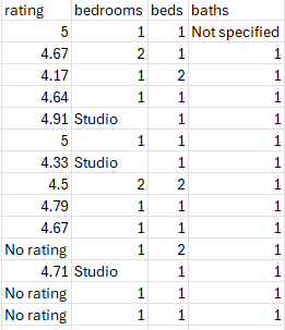
The most difficult aspect was creating lambda functions to remove or replace certain non int or float values. I had to modify the baths column as ther were some with no baths, the bedrooms as studio was in place of 0, and rating as a string with there to indicate instead.
Upload to a MySql Server
The next task was to upload the data to a MySql server, in which I did using Navicat.
Using this little query did the work:
CREATE TABLE ny_airbnb (
		id INT,
		id_listing FLOAT,
		`name` VARCHAR(200),
		host_id INT,
		host_name VARCHAR(50),
		neighbourhood_group VARCHAR(15),
		neighbourhood VARCHAR(50),
		latitude FLOAT,
		longitude FLOAT,
		room_type VARCHAR(20),
		price INT,
		minimum_nights INT,
		number_of_reviews INT,
		last_review DATE,
		reviews_per_month FLOAT,
		calculated_host_listings_count INT,
		availability_365 INT,
		number_of_reviews_ltm INT,
		license VARCHAR(25),
		rating FLOAT,
		bedrooms INT,
		beds INT,
		baths FLOAT,
		PRIMARY KEY (
			id
		)
)
After I upload the data and was set … well mostly. I ran into a problem with some of the columns not wanting to display properly in Tableau so I had to edit a few of the columns. For example I made the mistake of setting the missing rating values to -1 instead of NULL (for whatever reason).
UPDATE ny_airbnb

SET rating = NULL

WHERE rating = -1
Tableau
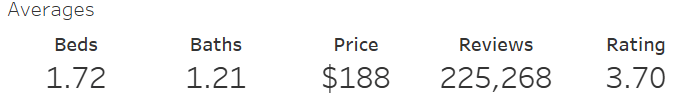
Finally the part I have been waiting for, making the actual dashboard. Simple and sweet for this one. Started with answering the first question of: How much is a rental in NYC? The first task was to create a KPI to crunch the numbers. With that the averages KPI for the beds, baths, price, number of reviews, and ratings was born.
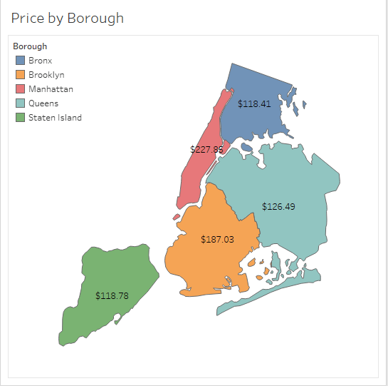
Next was onto the second question: By how much does it differ between the boroughs and within the neighborhoods themselves? I pondered for a while and played around with Tableau to come up with the best idea to visually represent it, a Treemap. Not just any Treemap but one that will allow the viewer to dive deep into each boroughs’ neighborhoods and see what the price is like there. So I allowed a toggle functionality between the boroughs and allowed the viewer to inspect. What is the best way to do something? With visuals of course so I made a mini map of the NYC boroughs and connected them to the Treemap and KPI. This way if a viewer clicks on the borough on the map its highlighted and the data appears for the other visualizations.

Lastly was the rating. Are these Airbnb really taken care of by these owners or are they modern dumps? I had to find out. As I was making a simple horizonal bar chart my curiousity got to me and I needed to know how many own multiple properties. So with that in mind I created the bar chart to have an initial sort by the owners who have the most Airbnbs.

All there was left to do was put in together. In a matter of a half hour, after painfully dealing with Tableau’s container sytem, the dashboard was born.
If you would like to check out the dashboard please click this link to take you to the public upload on Tableau’s servers.
Thank you for going through the process with me. Have a fanastic day!
